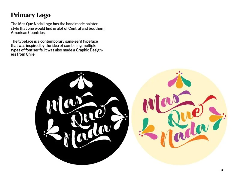
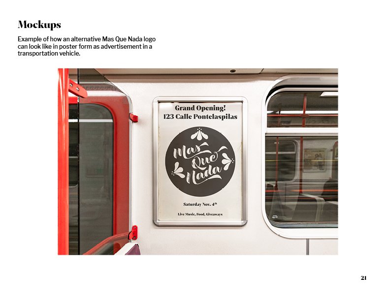
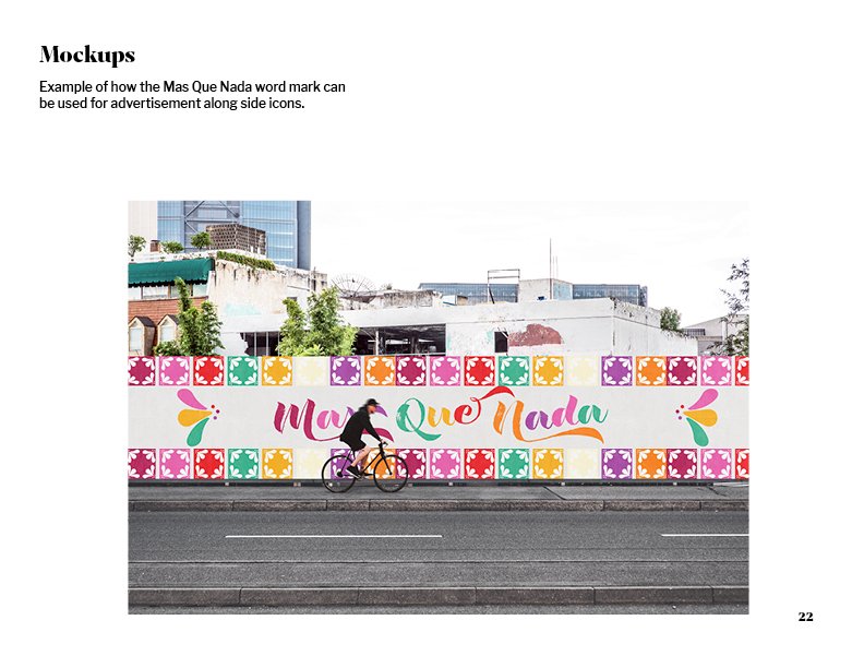
This project was to re-brand Mas Que Nada, a Latino store. The typeface was chosen to give remembrance of how stores have their names displayed in Latin America. The color scheme also represents typical colors that would be seen all around the Latino community. Mas Que Nada is supposed to feel like a safe place for those away from their native land and make when walking into this store feel like their right at home.
Mas Que Nada